
Podcast Thumbnails: How to Design Episode Images for More Clicks on YouTube and Spotify
A practical guide to podcast thumbnails: what makes episode images easier to click, how YouTube and Spotify treat them differently, and how to test better thumbnail packaging without turning your show into clickbait.
A lot of podcast teams spend serious time on the episode itself, then treat the thumbnail like a last-minute export decision. That is backwards. On YouTube and Spotify, the thumbnail is part of the pitch. It is often the first thing a stranger sees before they decide whether your episode looks worth a click.
That does not mean every podcast needs loud arrows, fake shock faces, or overdesigned nonsense. Usually the opposite. Good podcast thumbnails make the episode legible fast. They help the right viewer understand the topic, the energy, and the level of professionalism before a second of the conversation plays.
This matters even more if you already care about podcast episode titles, podcast chapters, or video podcast SEO. Thumbnails are part of the same packaging system. If the title says one thing and the image says another, the episode feels messy before it starts.
Why podcast thumbnails matter more than many shows admit
YouTube is unusually explicit about this. In YouTube Analytics, impressions measure how often your thumbnail was shown, and the platform tracks how those thumbnail impressions turn into views and watch time. That alone tells you how YouTube thinks about the image: not as decoration, but as a core part of the click decision. YouTube even lets creators A/B test titles and thumbnails and chooses a winner based on watch time, which is about as direct a signal as you can get.
Spotify makes a similar point in simpler language. Its creator documentation says eye-catching thumbnails can help videos stand out, increase engagement, and improve the chances of people pressing play. For video podcasts, that means your episode image is not just branding. It is an interface-level growth lever.
The practical takeaway is simple: a thumbnail does not need to be clever. It needs to be clear enough to earn the next action.
The biggest mistake is designing for the archive instead of the feed
A lot of podcasts still use episode art as if the job were just to label the file neatly. That produces visuals that are technically on-brand but weak in the feed: tiny text, low contrast, too many elements, or generic guest portraits with no visible editorial idea.
The feed behaves differently. People scan quickly. Your thumbnail usually appears small, surrounded by competitors, and paired with only a moment of attention. That is why the best episode thumbnails do three things well:
- establish one clear focal point
- support the episode title instead of repeating it badly
- look recognizable as part of the same show system
If the title carries the promise, the thumbnail should carry the mood, subject, or tension. It should not become a second paragraph.
What actually makes a podcast thumbnail easier to click
The advice here is less mysterious than the internet makes it sound. Most strong podcast thumbnails share a few traits.
1. One obvious subject
Usually that means a face, a microphone setup, a guest interaction, or a strong editorial crop. When the viewer has to decode five competing elements, the image loses.
2. Text used sparingly, if at all
Small text dies on mobile. If you use text, it should add a short phrase with real tension or clarity, not restate the full title in miniature. Many podcast thumbnails work better with no text at all, especially when the episode title already does the heavy lifting.
3. Contrast that survives small sizes
The thumbnail has to work when it is tiny. Clean lighting, strong separation between subject and background, and a readable silhouette matter more than intricate design flourishes.
4. Visual consistency across episodes
Spotify recommends using a consistent style or theme if you publish a series. That is sensible beyond Spotify too. Consistency helps people recognize your show, but it should be structural consistency, not identical-looking episodes. Think repeatable system, not template prison.
5. Packaging alignment
A thumbnail should match the promise of the title, the chapter framing, and the opening hook. If your title is tactical and your image feels random, click confidence drops.
YouTube and Spotify do not treat thumbnails exactly the same
This is where a lot of teams get sloppy. They assume one image works everywhere. Sometimes it does. Often it is a compromise.
YouTube recommends high-resolution thumbnails, ideally 3840 x 2160 pixels with a 16:9 aspect ratio, and notes that podcast playlists should use a 1:1 thumbnail rather than 16:9. Spotify says video thumbnails should be horizontal 16:9, with a suggested resolution of 1920 x 1080. Spotify also notes that thumbnails only display for video episodes; audio episodes use episode or show artwork instead.
That means your packaging system should account for context:
- YouTube episode video: 16:9 thumbnail matters a lot for search, homepage, and recommendations
- YouTube podcast playlist: 1:1 art matters for the show container
- Spotify video episode: 16:9 thumbnail appears on show pages, episode pages, and in search
- Audio-only distribution: episode or show artwork still carries more of the visual job
The smart move is not to overcomplicate this. It is to know which asset is doing which job.
A practical thumbnail workflow for podcast teams
If your team wants something repeatable, use a lightweight workflow instead of reinventing the image every week.
Start with the episode promise
Before design, ask what the episode is really selling: a contrarian claim, a timely topic, a guest perspective, a practical lesson, or a story. The thumbnail should reinforce that angle.
Pull two or three candidate frames
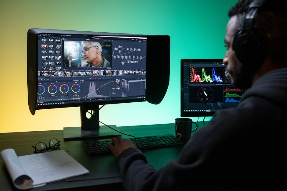
Do not settle for the default still. Review the recording and choose a few moments with good expression, clear composition, and enough negative space to crop well. This is easier when your clip workflow already surfaces the strongest moments from the episode.
That is a natural place where Loonacast helps. You can import a full episode from YouTube, RSS, Riverside, or file upload, generate a transcript with word-level timing and speaker detection, and use the surfaced story moments plus the Studio editor to find cleaner, more deliberate excerpts from the recording. Even though Loonacast is built for turning episodes into finished clips with captions, layouts, B-roll, branding, and exports, that same moment-selection workflow often gives teams better visual candidates for thumbnails too.
Make one strong default and one sharper alternative
YouTube now supports testing up to three title and thumbnail variants. Use that. A small change in crop, expression, color treatment, or text can outperform the “safe” version. The point is not endless experimentation. It is finding out whether your instinct about the click is actually right.
Review the thumbnail at small size
This step sounds trivial and saves a lot of mediocre publishing. Shrink it. Look at it next to other videos. If the focal point disappears or the text turns to mush, it is not ready.
What to avoid if you want your thumbnails to look premium
Some patterns make podcast thumbnails feel cheap fast:
- cramming in too much text
- relying on generic guest headshots with no visual hierarchy
- using low-contrast colors that disappear on mobile
- repeating the exact same composition every episode
- making the thumbnail louder than the episode title needs
The best thumbnails are usually edited, not overbuilt. They feel intentional. They make one promise clearly. Then they get out of the way.
Final takeaway
Podcast thumbnails are not separate from podcast growth. They are part of the same packaging system as titles, chapters, show notes, and clips. They influence whether an episode looks worth clicking, whether the promise feels coherent, and whether a show appears sharp or forgettable in the feed.
So do not treat the episode image like cleanup. Build a simple system: choose stronger frames, keep the focal point obvious, match the title’s promise, and test variants when the platform allows it. That is usually enough to move a thumbnail from acceptable to useful.
And if your team already turns full episodes into short-form assets, use that workflow to your advantage. The same transcript-driven review that helps you find better clips often helps you find better thumbnail moments too. That is one of the quieter advantages of a disciplined podcast repurposing workflow: better packaging decisions across the whole episode, not just better exports.
Turn your next podcast episode into clips faster
Loonacast helps podcasters repurpose long-form episodes into TikToks, Reels, and Shorts without spending hours in a video editor.